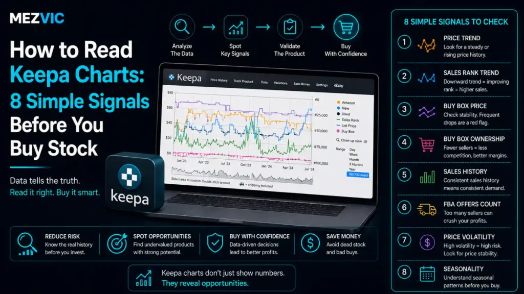
A Keepa chart is the difference between buying stock and gambling on it.
Learn to read Keepa charts and it shows you what a product has actually done for months or years: what it sold for, how often it sold, who else was selling it, and whether Amazon itself was competing with you.
All of that is free, sitting on the product page, and most sellers glance at it for four seconds and buy anyway.
Nobody teaches you to read Keepa charts. You are expected to absorb it, and most people absorb about a third of it.
Learning how to read Keepa charts properly takes about twenty minutes. It will save you from the two mistakes that end most sourcing businesses: buying something that does not sell, and buying something whose price is quietly collapsing.
In this guide, you will learn:
- What each line on the chart is actually telling you
- Why a falling line can be very good news
- Eight signals to check, in the order that saves you the most money
- The single flag that should stop a purchase outright
- Where Keepa’s data has genuine gaps, in Keepa’s own words
Key Takeaways
- On the sales rank line, every sharp drop is a sale. Lots of drops means lots of sales.
- A flat rank line means nothing has sold. Flat is the worst thing a Keepa chart can show you.
- Lower rank numbers are better, so the line moving down is the line moving in your favour.
- If Amazon’s own price line is solid and unbroken, you are competing with Amazon. Usually walk away.
- Gaps in Amazon’s line are the opportunity. That is Amazon going out of stock.
- Price the product at its 90-day average, never at today’s spike.
- A rising offer count with a falling price is a category filling up. Margins are about to go.
- Always zoom out to a full year before deciding. Ninety days hides every seasonal trap.
- A chart with almost no history is a new listing, and new listings have no evidence behind them.
- Keepa updates tracked products at least hourly, and untracked ones only several times a day.
- Keepa itself advises checking the live price on Amazon before you commit.
- Keepa Pro costs 29 euro a month or 290 a year, but the basic chart on the product page is free.
What the Chart Is Actually Showing You
Keepa draws several separate histories on one grid, each as its own coloured line. Match them against the legend on your screen and the whole thing stops looking like spaghetti.
What a Keepa chart is telling you
Six separate stories drawn on one grid. Learn what each one answers and the chart becomes a sourcing decision rather than a picture.
six answers
Keepa colour-codes each series in its legend. Match the names above to the colours on your own screen once, and you will never need to again.
Six questions, one picture, no guessing. That is what learning to read Keepa charts actually buys you.
The rest of this article is about the order you read Keepa charts in, because two of these can end the decision before you look at the other four.
The One Thing to Learn First: Drops Are Sales
If you take one thing from this article about how to read Keepa charts, take this.
Sales rank is a position, so a lower number is better. Rank 900 outsells rank 90,000.
When somebody buys the product, its rank improves sharply and then drifts back. On the chart that appears as a sudden drop followed by a slow climb.
So you are not reading the height of the line. You are counting the teeth, and people who read Keepa charts well do this before anything else.
Count the drops, not the level
The same 90-day window for two products. Each downward spike is Amazon recording a sale.
Illustrative shapes, not real product data. The rule is what matters: count the spikes over your chosen window and compare like for like.
Two products. Same category, same price, same box on the shelf.
One of them turns your money over ten times in a quarter. The other one turns it over twice, and you are paying storage on it the whole time.
Nothing else on the chart matters if the line is flat. Not the price, not the margin, not how much you like the product.
If you only ever learn to read Keepa charts for this one signal, you will still avoid most bad purchases.
8 Signals to Check, in Order
Read them in this sequence. Once you can read Keepa charts fluently, the first two end most decisions in ten seconds, which is the point.
8 signals, in the order that saves the most money
Work down the staircase. If a step fails badly enough, stop there and keep your cash.
This order exists so you fail fast. Working out margin on a product Amazon sells itself is wasted effort.
1. Does It Sell at All?
Set the chart to 90 days and count the drops in the rank line. That is the first test anyone learning to read Keepa charts should run.
There is no universal number of drops that means yes, because a rank of 8,000 in Toys is a very different business from 8,000 in Books. Anyone telling you a single threshold has not had to read Keepa charts across categories.
So compare within a category, not across categories. Open three products you already know sell well in the same category and use those as your reference.
What you are really asking is simple: will this turn over fast enough to be worth the cash it ties up?
Fifty units of something that sells twice a month is not inventory. It is a two-year commitment with storage fees attached, and those fees are covered in our breakdown of what Amazon FBA management costs.
Turnover speed is the whole argument for keeping stock lean, and it is one of the first things we look at in FBA management.
2. Is Amazon Selling It Too?
This is the fastest rejection on the list, and the one beginners skip because nobody told them to read Keepa charts in this order.
Amazon has its own price line. If it runs solid and unbroken across your whole window, Amazon is selling this product continuously.
You will not out-price Amazon on its own listing. It buys better than you, ships cheaper than you, and does not need the margin.
Read the gaps instead. Breaks in Amazon’s line are the interesting part: those are periods when Amazon was out of stock and third-party sellers had the Buy Box to themselves.
A product where Amazon disappears for weeks at a time can be a genuinely good buy. You are selling into the gaps.
Just size the buy for the gap rather than the year. Amazon coming back into stock with 400 of your units still in the warehouse is a specific kind of bad week.
Getting stock out of the warehouse quickly when that happens is a fulfilment problem rather than a sourcing one, and worth planning before it arrives.

3. What Is the Real Selling Price?
Today’s price is the least reliable number on the screen, which is the first thing you unlearn when you read Keepa charts seriously.
It might be a temporary spike because two sellers ran out. It might be a race to the bottom that ends next week. Either way it is one moment, and you are buying for the next several months.
Use the 90-day average Buy Box price as the figure you build your margin on. Keepa shows averages over several windows, and 90 days is the sensible default for most sourcing.
Then be pessimistic on purpose. If the average is $34 and the range is $28 to $41, do your maths at $30 rather than $34.
A deal that only works at the top of the range is not a deal. It is a hope with a spreadsheet attached.
If you plan to advertise the product too, that ad cost comes out of the same margin. Our comparison of ACoS and TACoS shows how much room a campaign actually needs.
Run the number properly before you commit. Our Amazon FBA calculator takes fees and fulfilment off the top so you see what actually lands in your account.
4. Which Way Is the Price Heading?
A price can look healthy today and still be in a long slide, and only a longer window reveals it.
Set the chart to a year and ask one question: is the general level this quarter higher or lower than the same quarter last year?
A steady downward drift usually means one of three things, and all of them are bad for you.
- More sellers arrived and are competing on price alone.
- Demand is fading, often because a newer model exists.
- The brand cut its own price, and everyone downstream had to follow.
Buying into a falling price means your margin shrinks while your stock sits in a warehouse. By the time you list, the number you planned around is gone.
Falling prices also squeeze what you can afford to bid, which is why sourcing and Amazon PPC decisions belong in the same conversation rather than separate ones.
5. How Crowded Is It Getting?
The offer count tells you how many sellers are on the listing. Its direction matters far more than its level, and this is where people who read Keepa charts casually get caught.
Fifteen sellers, stable for a year, is a mature listing with a settled price. That is fine.
Three sellers in January and eighteen by June is a completely different story. Everybody found the same supplier, and the price has not finished falling yet.
The pattern that should stop you: offer count rising while the price line falls. Those two lines moving in opposite directions is a category filling up in real time.
If you can see it happening on the chart, you are already late. The sellers who profited from that product bought six months ago.
Crowded listings also mean your product page has to work harder than everyone else’s, which pushes you toward Amazon SEO rather than price cuts.
6. Is It Seasonal?
This is the mistake that costs the most money per occurrence, and it is entirely avoidable if you read Keepa charts over a long enough window.
A 90-day window cannot show you a yearly cycle. Look at a product in November and everything is glorious. Look at the same product in February and it is a different business.
Always zoom out to a full year before buying. Ideally two, so you can confirm the pattern repeats rather than guessing from one cycle.
Seasonal products are not bad. They are just timing-dependent, which means the same chart says buy in August and do not buy in December.
The trap is buying at the peak because the numbers look best exactly then. Everybody’s numbers look best then. That is what a peak is.

7. How Old Is the Listing?
A chart that only goes back six weeks is not telling you the product is bad. It is telling you nothing at all, which is a different problem, and no amount of skill at reading a Keepa chart fixes missing data.
New listings have no price history to average, no seasonal pattern to check, and no evidence about how competitive it becomes once other sellers notice.
You can still buy it. Just be honest that you are making a judgement call rather than an evidence-based decision, and size the order accordingly.
There is a related gap worth knowing, and it comes straight from Keepa. Update frequency varies by how closely a product is watched: a product somebody is actively tracking updates at least once an hour, while most others update several times a day.
So an obscure product’s chart is a lower-resolution picture than a popular one’s. Not wrong, just coarser, and worth remembering before you read too much into a small detail.
Thin data is also a reason to start small on unproven products and let your own sales history become the evidence, which is how a well-run Amazon account builds a sourcing edge over time.
8. Does the Used Price Undercut You?
The last check, and the one people forget because they are looking at the new price only.
Used offers sit on the same listing and compete for the same buyer. On plenty of categories a good-condition used copy takes a meaningful share of sales.
If used copies are consistently well below your intended price, your effective competition is lower than the new price suggests, and your sell-through will be slower than the rank line implies.
This matters most in books, media, tools and anything durable. It matters least in consumables and anything people will not buy second-hand, for reasons we do not need to explore.
Whichever condition you sell, the listing has to be compliant before it can rank at all. Our guide to fixing a suppressed Amazon listing covers the rules that quietly hide products from search.
Green Flags and Red Flags at a Glance
Keep this next to you for the first month of sourcing. After that you will read Keepa charts without consciously working through the list.
| What you see | What it means | Verdict |
|---|---|---|
| Frequent rank drops | Selling steadily throughout the window | Green flag |
| Amazon’s line has long gaps | Amazon runs out, leaving room for you | Green flag |
| Stable price over 12 months | Mature listing, predictable margin | Green flag |
| Offer count flat for a year | Settled competition, no gold rush | Green flag |
| Flat rank line | Almost nothing is selling | Red flag, stop |
| Unbroken Amazon price line | You are competing with Amazon directly | Red flag, usually stop |
| Offers rising, price falling | The category is filling up right now | Red flag |
| Price lower every quarter | Structural decline, not a dip | Red flag |
| Six weeks of history | No evidence either way yet | Proceed carefully |
| One enormous spike | Usually a stockout, not real demand | Ignore the spike |
Two green flags do not cancel a red one. The red flags are veto conditions, not points in a total.
That last row deserves its own warning, because it fools people who are otherwise being careful.
A single dramatic price spike almost never means demand suddenly surged. It usually means every seller ran out at once and the only remaining offer was somebody chancing it at triple the normal price.
Nobody bought at that price. It is a gap in supply drawn as a mountain, and building your margin on it is how people end up with expensive stock and a confused expression.
What Keepa Will Not Tell You
Worth being clear about the limits, because learning to read Keepa charts well invites a very specific over-confidence.
| Keepa answers | Keepa cannot answer |
|---|---|
| What it sold for | What it costs you to buy |
| How often it sold | Whether you can get more of it |
| Who else is selling | Whether the category is gated for you |
| How crowded it is | Whether the brand enforces against resellers |
| The price trend | Your fees, shipping and storage |
| Historical demand | Return rates on the product |
The right-hand column is where most sourcing losses actually come from.
The brand enforcement one is worth real attention. A product can pass every check on this page and still be one that the brand actively removes resellers from.
That does not show up on any chart. It shows up as a complaint against your account, and dealing with it is a different job entirely, covered in our marketplace suspension playbook.
Keepa is also candid about its own accuracy. Its data updates constantly and is usually current, but prices move all the time, so Keepa advises checking the live price on Amazon before you finalise anything.
Sensible advice from a company that could easily have not said it. Both points come straight from Keepa’s own help pages.
Do You Need Keepa Pro?
The chart on the product page is free. The subscription buys you tooling around it.
Keepa Pro is 29 euro a month, or 290 euro a year, which Keepa describes as twelve months for the price of ten.
Paying annually saves 58 euro against monthly billing, which is roughly a 17% discount for committing.
The honest split:
- Sourcing occasionally, checking products one at a time? The free chart does everything in this article.
- Screening hundreds of products, or hunting for candidates rather than checking them? That is what the subscription is for.
The break-even is not really about money. At 29 euro a month, taken from Keepa’s published pricing, one decent avoided mistake pays for a year.
It is about whether you are checking products you already found, or searching for products you have not found yet. Only the second job needs paying for.
That is the same test we applied to eBay research tools in our honest look at Zik Analytics and Terapeak: pay when you can name the specific thing the free option will not do.
A 60-Second Routine You Can Actually Keep
Once the eight signals are familiar, this is how you read Keepa charts in a shop aisle with a phone in one hand.
- Set the range to one year. Not 90 days. This is the step people skip.
- Look at the rank line. Busy and toothy, or flat? Flat means walk away.
- Look for Amazon’s line. Solid across the year means walk away.
- Read the 90-day average price, then knock 10% off it for safety.
- Glance at the offer count direction. Rising fast while price falls means walk away.
- Put your safe price into a calculator with your real cost, fees and shipping.
- Check the live price on Amazon before you pay for anything.
Three of those seven steps are permission to walk away, which is the correct ratio. Most products are not worth buying, and the value of research is mostly in the rejections.
Once a product does pass, the work moves to the listing itself. Our Amazon listing score checker is a quick way to see whether the page is ready to sell what you just bought.
Step six is where sourcing decisions are actually won or lost. Use our profit margin calculator if you sell across several channels, or the FBA one if everything goes through Amazon.
Frequently Asked Questions
How do you read a Keepa chart?
To read Keepa charts, treat them as several separate histories on one grid: Amazon’s own price, third-party new, used, sales rank, Buy Box and offer count. Start with the sales rank line, because each sharp drop represents a sale, then check whether Amazon’s price line runs unbroken across the window.
What does a drop in the sales rank line mean?
A sale. Sales rank is a position where lower numbers are better, so a purchase improves the rank sharply before it drifts back. Counting the drops over a fixed window is the most reliable read of how often a product actually sells.
Is a flat sales rank line bad?
Yes, and it is the clearest single reason not to buy. A flat line means nothing sold during that period. No price, margin or product quality argument survives a flat rank line, because you are buying stock that has no demonstrated demand.
Should I avoid products Amazon sells?
Usually, if Amazon’s price line is unbroken across your window. If Amazon goes out of stock regularly, leaving visible gaps, third-party sellers can do well in those gaps. Size the purchase for the gap rather than the whole year.
Which price should I use for my margin maths?
The 90-day average Buy Box price, reduced slightly for safety. Today’s price can be a temporary spike caused by stockouts or a race to the bottom that has not finished. If a deal only works at the top of the historical range, it is not a deal.
How far back should I look?
At least one full year, and two where the history exists. A 90-day window cannot reveal seasonality, and buying a seasonal product at its peak is the most expensive single mistake in sourcing.
What does a rising offer count mean?
More sellers arriving on the listing. On its own that is neutral, but a rising offer count alongside a falling price means the category is filling up and margins are still compressing. If you can see it on the chart, you are already late.
Why does a product show a huge price spike?
Almost always a stockout rather than real demand. When every reasonable offer sells out, the only remaining listing may be priced far above normal, and typically nobody buys at that price. Treat single dramatic spikes as noise and exclude them from your averages.
How often does Keepa update its data?
It varies with interest in the product. Keepa states that a product being tracked by someone updates at least once every hour, while most others update several times daily. Obscure products therefore have a lower-resolution history than popular ones.
Is Keepa data always accurate?
Keepa says its data is constantly updating and usually current, but that prices fluctuate constantly so its figures can occasionally lag slightly. Keepa’s own advice is to double-check the price on Amazon before finalising a purchase, which is sensible for any sourcing decision.
How much does Keepa cost?
The product-page chart is free. Keepa Pro is 29 euro per month or 290 euro per year, which Keepa describes as twelve months for the price of ten. Paying annually saves 58 euro, roughly 17%.
Can Keepa tell me if a product is profitable?
No. Keepa shows what a product sold for and how often, but it does not know your cost price, your fees, your shipping, your storage or your return rate. Those are where most sourcing losses come from, so the chart narrows the decision rather than making it.
The Bottom Line
Learning to read Keepa charts is the highest-return twenty minutes available to anyone buying stock for Amazon.
Count the drops. Look for Amazon. Use the average, not today. Zoom out to a year. Do those four things and you already read Keepa charts better than most sellers.
Those four habits will reject most of what you look at, which feels discouraging for about a fortnight and then starts feeling like a superpower.
That is the honest reward for learning to read Keepa charts: not more buying, but much better buying.
Because the money in sourcing is not made on the good buy you found. It is made on the eleven bad buys you walked away from while somebody else was loading a trolley.
If you sell the same stock across more than one channel, the same discipline applies everywhere, which is most of what managing several marketplaces comes down to.
Want a second opinion on your sourcing criteria? Book a free 30 minute call. If the products are already bought and the listings are the bottleneck, listing optimisation is usually where the next win is.